If you are reading this article, then one thing is clear as sunshine in summer!
You want to boost the user-friendliness of your or a client’s ecommerce app.
Bravo! You have embarked upon a journey that half of the brands in any niche on average don’t!
Well, after backslapping yourself enough, you would start to rationalise this decision of yours.
How can you possibly make an ecommerce app more user-friendly? Or, what are the essential features of a user-friendly ecommerce app in the first place?
Read on. You would find the answer.
Essential ecommerce app feature: Your app should be responsive
You are probably wondering, “what’s the point talking about responsiveness? It’s a mandatory criterion which everyone knows about.”
You would be right to think this way. Responsiveness today acts as one of the pillars specially when it comes to ecommerce app development.
Still, I want to make sure we are on the same page about app responsiveness.
A responsive app is one that rearranges its interface elements according to the size of the device it is being viewed on to ensure maximum usability for its users.
The scope of responsiveness is no longer limited to screen size.
Users now expect an app to be able to interact with digital assistants like Alexa and Google Home ans smartwatches.
Furthermore, 1 out of every 2 people is projected to perform online voice searches.
Thus your ecommerce app would likely need to have voice search enabled along with the capability to interact with various other devices and software.
With app responsiveness covered, let’s move on to –
Essential ecommerce app feature: Your app should be easy to navigate
There is no way to put enough emphasis on this feature!
I come across numerous apps that leave me all confused.
Which is why, when you have your ecommerce app developed or redesigned, do make sure the navigation is simplified to a fault!
If your app is easy to navigate, its users would be able to get where they want to easily and fast from wherever they are on the app real estate.
When designing the navigation for your app, two features would drive usability. Those are:
- The back button
- Breadcrumbs

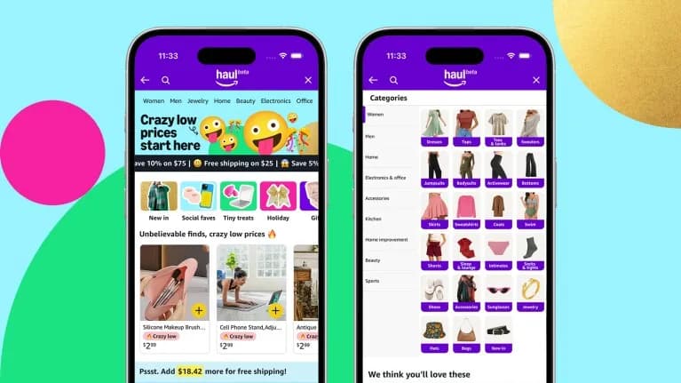
As you can see in the above picture, any user would where he/she is on the app and has the liberty to go to any other real estate easily. That is the kind of ease your app would benefit from!
Let’s now talk about
Essential ecommerce app feature: Your app should be intuitive
Remember website popups that disappear when you click or tap anywhere outside the popup border? That is a great example of intuitiveness!
So how can you implement it in your ecommerce app?
The first step would be to find out how people use apps in general. Some of the movements people perform in almost all apps are pinching to zoom in or out on something, double-tapping to enlarge the image, text or screen, swiping to access the next page etc.
If you implement these moves in your app, it will keep your users relaxed. That way, they would be inclined to engage with your app more.
Remember, your app is not supposed to require your users to think a lot to figure out. This way, the learning curve would be low. Such ease of learning to use your app would translate into longer app usage which is highly likely to boost conversion!
Now that we have discussed intuition for your ecommerce app, let’s talk about
Essential ecommerce app feature: Your app must have a simple yet breathtaking user interface
People love beauty. But when it comes to apps, they also desire a simple user interface.
With billions of apps out there that people use daily, their expectation regarding aesthetics is at an all-time high.
So your ecommerce app is supposed to be able to charm your visitors into spending longer time on it. That is where simplicity and navigation come in which I have talked about above.
For a beautiful interface, make sure you choose a colour palette based on your brand persona and voice. If you are selling phone cases, then you should go for bright, engaging colours. But if it is tie pins you are selling, you would probably benefit from a more sombre colour choice.
Apart from colour, your app interface should provide a deeper and richer experience to your users.
Since your app is an online store, they must be able to experience your services and products offered in the app in diverse ways.
Such a well-rounded experience can be delivered through the use of built-in sensors such as accelerometer, microphone etc.
Cheer up! We have only one more feature to discuss.
That is
Essential ecommerce app feature: Your app must be secure
With cyberattacks and data-theft on the rise, ever app owner must go the extra mile to keep their apps secure.
This additional measure regarding app security is extremely important for e-commerce app owners. Such aggravated importance is because users would input important financial and personal data when using such apps.
Security measures include, but not limited to, 2-step authentication, card-holder identity verification and (affordable) Cheapest Code Signing certificate for securely interactions with the app server and prevent tampering.
This is where our discussion ends.
Remember. Making your ecommerce app user-friendly and keeping it that way is not a goal. It’s a continuous journey.
Staying on course to delivering awesome experience thus would require you to stay informed on UI/UX tactics, gather data from app usage analytics and of course, talk to your customers.
Good luck with the journey!
Author Bio:
Ryan Aslatt is a web strategist, freelance writer, and an independent blogger. He currently works at WebAlive a Mobile App Developer Agency in Melbourne. He is used to writing well-researched articles that readers will find insightful, engaging and highly informative.


